
Review: The 2017 Wacom Intuos Pro
This Valentine's day, I got a little present from my love, Wacom. It was the brand new Intuos Pro!
They refreshed the product line this year so I got a chance to check it out. Surprisingly, I found the update to really tighten up on a lot of areas. I didn't have to do a review, but I actually felt it should be done since they improved this product in a lot of ways. If you've been wondering about it, this is for you.
Truthfully, I wasn't sure if I would even really notice a big difference from the previous version. After using it for about 60+ hours, I can appreciate the changes. It's definitely a revision of nuances that amount to the polished package.
The Size
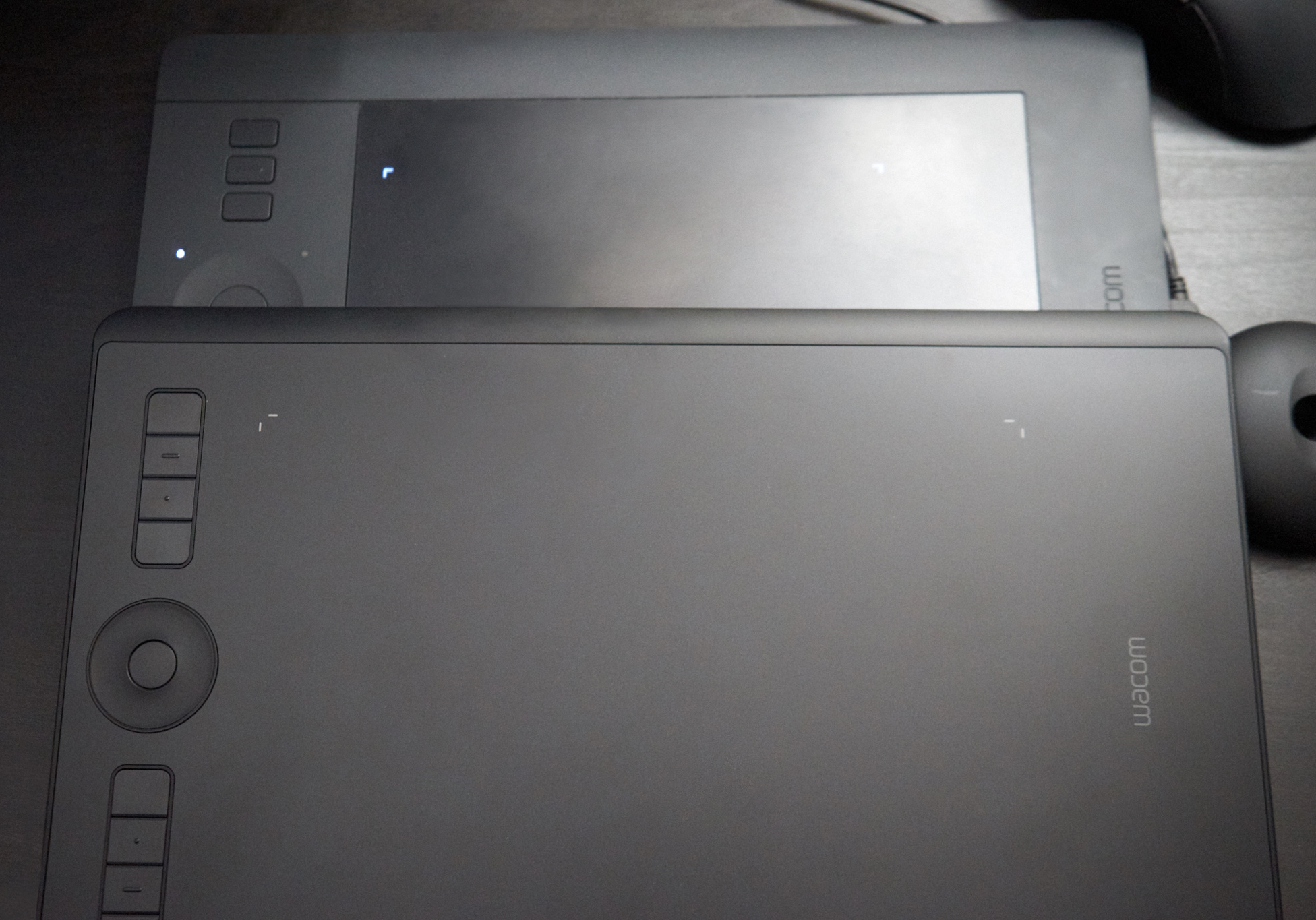
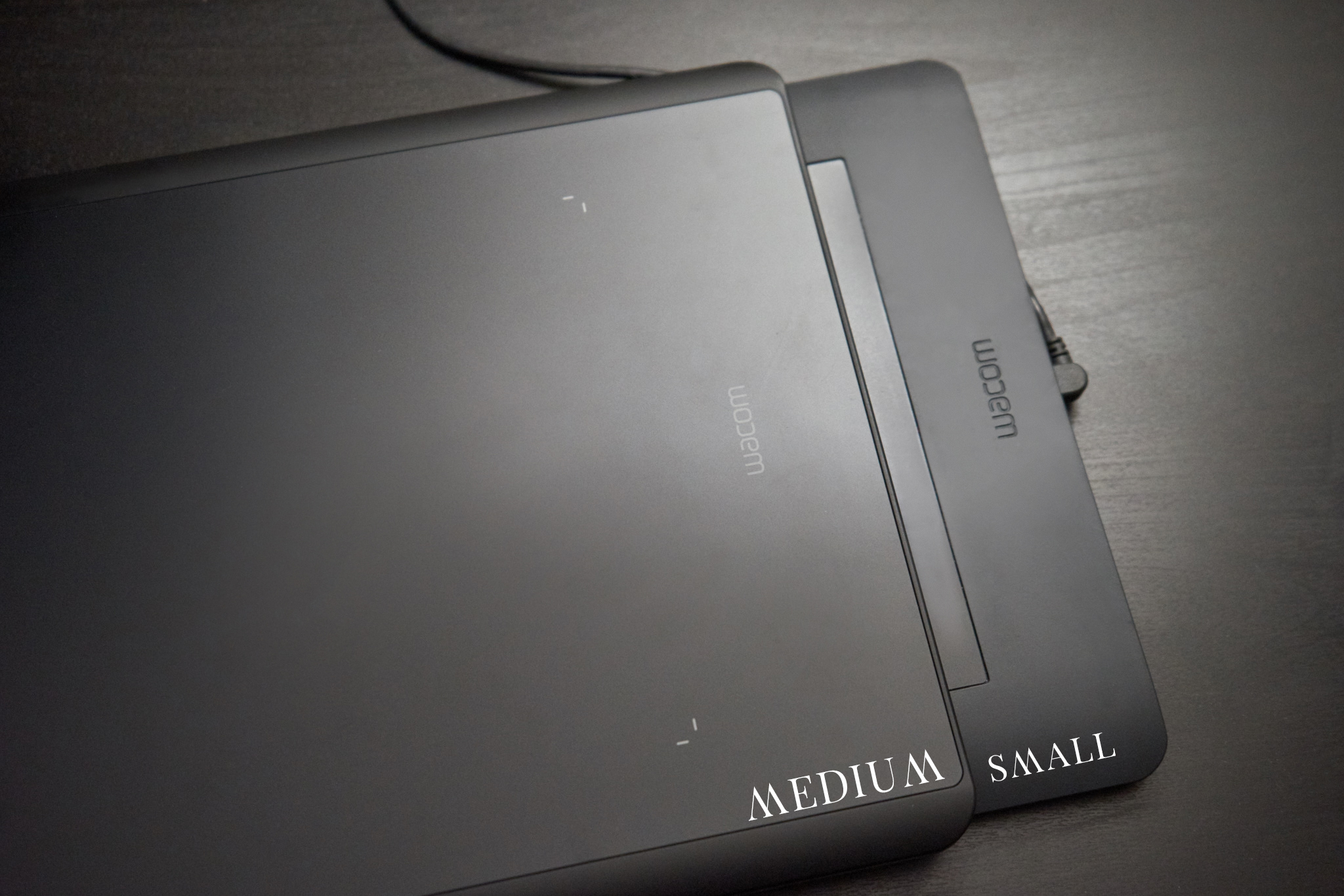
The updated Wacom Intuos Pro (2017) only comes in medium and large. If you know me, I am all about the small (no time for jokes!) so I wasn't sure if I would keep it. Fortunately, it turns out they did some trimming!
As you can see from the comparison, the medium is practically the same physical size of the small! They expanded the working area space and compressed unnecessary filler space. It makes the tablet fit in the same spot as my small and I can comfortably use my dual screen setup now.
Even after mapping both screens to the tablet, I also have additional room to comfortably place my mouse on the end. Since there's no gap/ridge, it works perfectly.
Size comparison:
Small (current) - 320 x 208 x 12mm
Medium (2017)- 338 x 219 x 8mm
This means that if they refresh the small, it will be even smaller and perfect for travelling light.
Thinner, Lighter, and Stronger
Another size change is how thin it has become. It's about 1/3rd thinner and more compact. It feels much lighter as well. On the other end, is a USB-C connection point. One issue people had on the previous tablet was the connector not being resilient. The USB-C connector is really strong and doesn't budge at all. It doesn't wiggle and isn't as prone to breaking or having connection issues.
Wireless Included
On previous versions, you'd be required to purchase or add on a wireless unit. It took up additional space. On this tablet, it's all built in and somehow still manages to stay quite thin. You don't even need the additional hub that you previously needed to plug into a USB slot. I don't use wireless most of the time but it's a great bonus. Also it looks much cleaner this way not having that separate compartment.
Updated Stylus
The Pro Pen 2 is an upgrade from the Intuos Pro stylus I'd been using. I use the buttons a lot on the pen itself to scroll up and down my layer stack. Some use it for alt/option, and other configurations.
The buttons themselves have less resistence when clicking them and the top one also doesn't stick out as much, making it easier and faster to press down. If you work on a tablet for most of your day, every day, these little changes are important. If you don't, then you may not even care.
I don't use pressure myself, but it's worth noting that it now has 4X more levels of pressure sensitivity, from 2048 to 8192.
Updated Nib Design
They also updated their nibs! The base itself has changed and it's become a starfish like configuration in layout. More importantly, the shaft is thinner and what I noticed is the contact point within the pen feels more accurate. I do like them a lot and haven't had any issues with them so far. This may also be the reason why they were able to get more levels of pressure sensitivity out of them, with how secure their fitment is.
The metal base itself is low profile. For me it has been hard to screw and unscrew unless I pick it up and place it in the palm of my hand to twist it open. I can't do it just using the desk itself. Otherwise it looks great sitting on the desk.
The Little Things
They're put some effort into the re-design of the product. Even down to the little details like the metal embossing on the back, to the intentional removal of the ridges on the front of the tablet. It creates for a refreshed look and a solid feel.
The base also has those rubber strips at the bottom that let the tablet sit with a clean stance. It hasn't moved much no matter how aggressive I use it. I can also tell in the long run, it won't wear out easily.
The Buttons, Wheel, and Surface
Much like the pen, the buttons can be pressed down much easier in comparison to the last model. I use them for different flow settings. The wheel itself feels a lot more fluid, like it was on the Intuos 4. It also is smoother than the previous version so there's no resistance.
The surface itself is pretty much what you'd expect. You can change it out yourself! Also, you can now purchase different texture sheets of variable feels. So when it wears down, you can easily change it out.
"Choose from three different Texture Sheets* to change the feel of your Wacom Intuos Pro. Each simulates different drawing papers, from smooth to rough."
Personally, I prefer a really slick surface so I tape down a plastic transparency sheet on top of my tablet, cut to the size of how I mapped my surface. My nibs also don't wear down that way. I can retouch as fast as humanly possible without any of the drag. To me, it saves time and that brings in more $.
Overall
I was honestly not expecting to find much of an improvement over the previous version, but they really did a lot to this version. It's a much welcomed update. If you're due for an upgrade, I don't see much of a reason not to get this model.

